
How to Style Linen Bedding Like an Interior Designer
Linen bedding looks effortlessly chic in design magazines — but how do you actually achieve that look at home? Here's how interior designers style linen beds.
There's a specific kind of bedroom you see in design magazines: the bed is rumpled but somehow perfect, the linen is textured and natural, the whole thing looks effortless. That look is almost always linen. And the good news is it's genuinely not that hard to achieve — once you understand a few principles that interior designers use consistently.
Start With Your Base: Choose the Right Tone
The foundation of a well-styled linen bed is colour. Interior designers almost universally lean toward neutrals and natural tones for linen bedding — and for good reason. Linen's texture and drape are most visible in natural light, and bold colours can overwhelm the organic quality that makes linen special.
The most versatile base tones: natural/oatmeal, white, flint, stone, and warm sand. These work in any bedroom, pair with almost any wall colour, and look better as they age and soften. If you want a colour, try it as an accent (a throw or extra pillowcase) before committing your full sheet set to it.
The Art of the Intentional Rumple
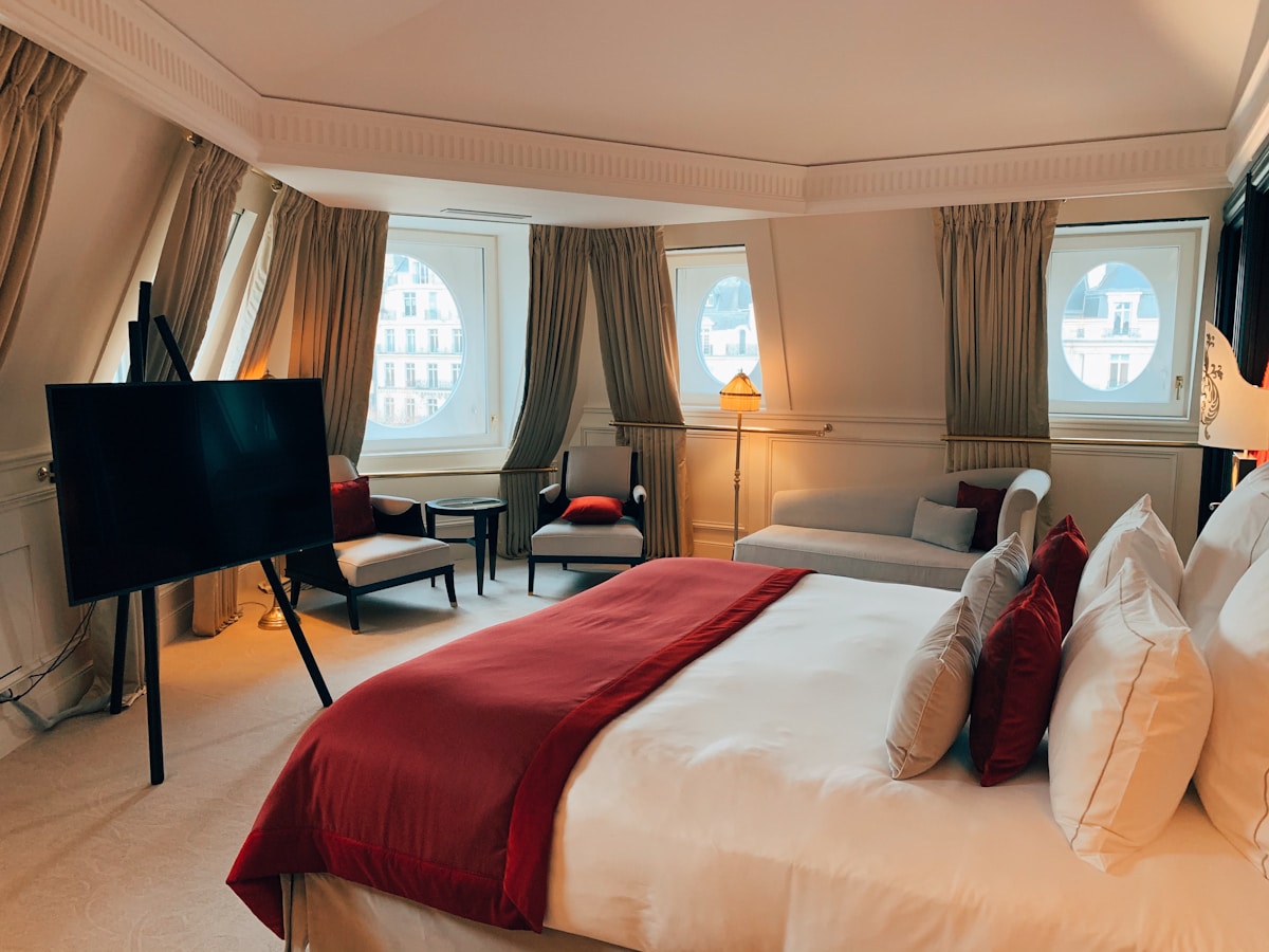
The most common mistake people make with linen bedding is trying to make it look like cotton. Linen is not cotton. It wrinkles — and that's the point. The goal isn't a perfectly smooth, hotel-pressed finish. It's a relaxed, lived-in look that still feels curated.
How designers do it: pull the duvet up, then fold the top third back toward the foot of the bed. Smooth the visible section lightly with your hands — not aggressively, just enough to take out the major creases. Leave the fold slightly uneven. That slight imperfection reads as intentional rather than unmade.
Layer, Layer, Layer
A single duvet cover and two pillowcases is underwhelming. The beds that stop you mid-scroll on Instagram are layered. Here's a simple designer formula:
- Base layer: Fitted sheet + flat sheet in your neutral linen
- Middle layer: Duvet in a complementary linen tone (or the same tone, tone-on-tone works beautifully)
- Accent layer: A folded throw or quilt at the foot of the bed in a contrasting texture — waffle cotton, chunky knit, or a lightweight blanket
- Pillows: Two Euro shams (large square) at the back, two standard or king pillowcases in front, one or two accent cushions in a different fabric
This creates visual depth without looking fussy.
Mix Textures, Not Too Many Colours
The designer trick that makes linen beds look expensive: mix textures within a tight colour palette. A rough-woven linen duvet, a smooth cotton flat sheet, a chunky-knit throw, and a velvet cushion — all in shades of cream, sand, and warm white — is infinitely more interesting than matching everything in the same fabric.
Keep colours tonal (variations of the same hue) rather than contrasting. The texture does the visual work so the colour doesn't have to.
The Pillow Formula
Pillows make or break a styled bed. Too few looks bare; too many looks like a sofa showroom. The sweet spot for most beds:
- Queen bed: 2 Euro shams + 2 standard pillowcases + 1 lumbar cushion
- King bed: 2–3 Euro shams + 2 king pillowcases + 1–2 accent cushions
The Euro shams should be the tallest element at the back. Layer the sleeping pillows in front of them, then the accent cushion(s) at the front. That slight height gradient is what gives the bed its structured-but-relaxed look.
Don't Fight the Wrinkles
One more thing designers consistently say: stop ironing your linen. The wrinkles aren't a flaw — they're the aesthetic. If you're pulling out an iron every time you change the sheets, you're working against the material. Instead, pull linen from the dryer slightly damp, shake it out, and let it air dry on the bed. The natural drape will take care of itself.
Natural tones, pre-washed linen — ready to style
Disclosure: Some links are Amazon affiliate links. We may earn a small commission at no extra cost to you.
Frequently Asked Questions
What colour linen sheets look most luxurious?
Natural/oatmeal, white, and warm stone tones consistently look the most luxurious because they highlight linen's natural texture. Avoid very bright whites, which can look stark. A warm white or undyed natural tone has more depth and richness.
Should linen sheets match the duvet cover?
Not necessarily. Tone-on-tone (similar shades of the same colour) often looks more sophisticated than a perfect match. A natural sheet with a stone duvet, or an oatmeal sheet with a warm white duvet, creates subtle depth that a perfect match doesn't.
How do I keep linen looking good between washes?
Shake out your duvet and pillows when you get up, let them air briefly before making the bed, and do a light hand-smooth over the visible linen. That's genuinely all you need. The lived-in texture is the point — you're not trying to achieve a showroom look.
What's the best throw for a linen bed?
A chunky knit or waffle-weave cotton throw in a complementary neutral. Avoid fleece or synthetic throws — they clash with linen's natural aesthetic. A folded linen throw in a contrasting tone also works beautifully and ties the whole bed together.